For email marketers, every element present in an email is bankable!
From the subject line to the body text through the email signature, one can optimize every single aspect of an email to trigger actions. While email subject lines are designed to grab attention, the CTA buttons are to set off desired actions, and similarly, a simple looking sig line can be used to accomplish small as well as large marketing goals.
If you’re signing off your marketing email with mere ‘best regards’, you’re missing out on some great marketing exposure. Today we’re going to talk about email signature tips that are thoughtful and actionable. Let’s get started…
1. Brand affiliation and contact information
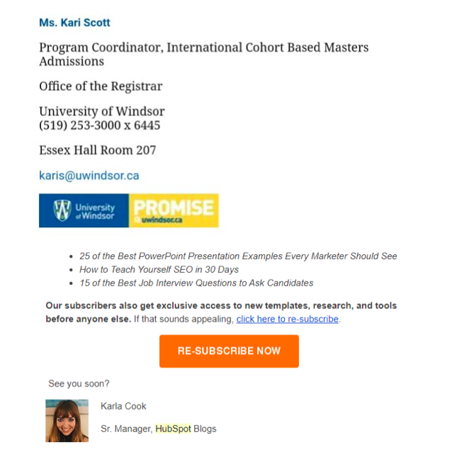
Irrespective of how old or new your email contact is, putting in information about your organization, job title, or the brand you are associated with is imperative. Your name should definitely be the first signature element that goes there but closing it with the brand name or even a logo can portray a more sophisticated POV to the readers who see it.
Download Branding Resources Guide
Building a brand starts by having the right tools and advice. Download our top 10 essential tools and resources to kick-start your branding.

Apart from that, secondary contact information is something you should have a practice of mentioning. If you don’t want to give out your personal contact number, a company website or an extension number can also do the trick.
Examples
2. Play with colors but maintain consistency
Playing with colors in your fonts, background, or imagery is a good practice to leave a lasting impression, but never go overboard with random palettes. Choose the ones which represent your brand persona and stick with it.
Example
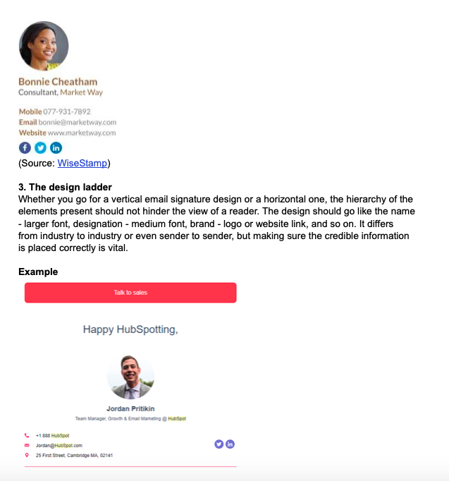
(Source: WiseStamp)
3. The design ladder
Whether you go for a vertical email signature design or a horizontal one, the hierarchy of the elements present should not hinder the view of a reader. The design should go like the name – larger font, designation – medium font, brand – logo or website link, and so on. It differs from industry to industry or even sender to sender, but making sure the credible information is placed correctly is vital.
Example

4. Utilize signatures to trigger actions
CTAs in emails are essential, but if you want to utilize the signature space to notify something new or relevant to the reader, you can use links and CTAs in email signatures as well. Again, when you are using this space which is not a sales deck, don’t try to be pushy about the call to action. Remember, email signatures are not your primary source of conversions.
Example
5. Linking Social Profiles
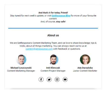
While this is the fifth point in our post, you can find social media icons in almost every example that we have shared! Social media pages are important and having a credible social profile says a lot about you. 71% of consumers who have had good social media service experience from a brand, recommend it to others. Thus, having an active social media profile can work wonders for you. While you’re signing off in an email, you can put up quick links to your social profiles for the readers to easily click on them.
Example
6. The use of dividers
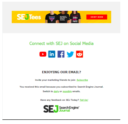
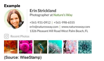
When designing an email signature, you want to add as many relevant elements as possible such as the secondary contact, website, social profiles, images, and more. Now when this is the scenario, the wise implementation of dividers helps you create a clutter-free design. All in all, the elements should not overlay any other information present while giving each of the significant attention.
Example
(Source: WiseStamp)
7. Make it engaging
When we say keep it engaging, it doesn’t stop with an appealing design, but also comes with a few cues that make it click-worthy! Simply putting in icons and links is expected from every marketer, what you can do differently is providing appointment booking links and calls-to-action. Share a personalized meeting link that automatically lets the user to book a slot.
Example

8. Follow the trends
You should revamp your email signatures from time to time with the latest information or a new format. Just like email template design trends, email signature trends also evolve. One such noteworthy trend is to add moving objects or GIFs in your email signature. There are numerous aspects you should keep in mind while adding something like this due to visibility criteria, screen size variations, email client support, and more, but there’s nothing wrong in employing them with precautions.
Example

(Source: WiseStamp)
9. Mobile optimization
Just like HTML emails, the signatures in them also require special compliance for different email clients. For instance, a signature that’s a GIF might have support for Gmail, but won’t render in Outlook. Similarly, with screen size and resolution support mechanisms, different email signatures work differently depending upon the device. The future is mobile, and if you are not designing responsive email templates (including signatures) you are toying with user experience. Emails with display disruptions get deleted within 3 seconds and if you do not wish to fall under the deleted emails category, it’s time you go mobile while designing an email.
Example

(Source: WiseStamp)
10. Test, and test some more
We are aware of the traceable email CTAs and other aspects that we generally analyze in an email. You can take help from the heatmaps to determine where people are focusing or clicking in your signature. Try sending test emails with distinct signatures and measure the performance. You can instill any or all of the above-mentioned tips while you test and choose once the results are out.
Extra Byte
Where your email recipients are situated, is a very crucial piece of information. If you’re catering to a global audience, you can set up an email signature that is general and can be helpful to anyone reading it. But, if you’re sending location-based emails, keep the business laws in mind. For instance, as per the Netherlands law, one has to include details like company name, registration number, registry location, registered office, and more. It is advisable to consult a legal representative to double-check your crafted email.
Conclusion
Email marketing is here to stay, and the innovations in email designs, HTML templates, and email marketplace as a whole are noteworthy. If you want your campaigns to perform, don’t leave any element of the email unattended. We hope the above-mentioned 10 email signature tips will help you create better sign-offs the next time you send an email.
Kevin George is Head of Marketing at Email Uplers, one of the fastest-growing custom email design and coding companies, and specializes in crafting professional email templates, PSD to HTML email conversion and free HTML email templates in addition to providing email automation, campaign management, and data integration & migration services. He loves gadgets, bikes, jazz and eats and breathes email marketing. He enjoys sharing his insights and thoughts on email marketing best practices on his blog.


