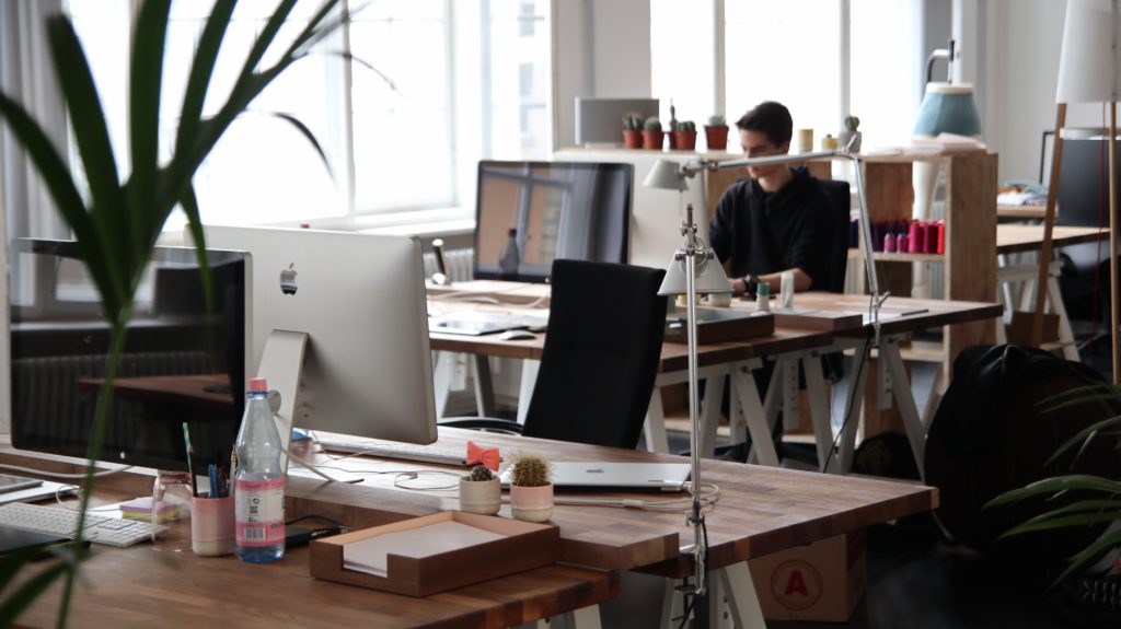
Stretched thin between trying to stay above the surface and deciding on the right marketing approach for their products or services, not many startup owners have time to consider what their office design says about their brand. However, when it comes to the appearance of the office, there’s rarely a second chance. The moment a new client or potential partner walks into your place of business, the impression they get directly translates to you as an organization. The question, however, remains whether you are making the desired impression?
Download Branding Resources Guide
Building a brand starts by having the right tools and advice. Download our top 10 essential tools and resources to kick-start your branding.

More than meets the eye
At this point, you need to clearly define what message do you want your office to send about your brand. Would it be a statement of a strong and energetic enterprise? Is there an element of clockwork precision, planning, and organization? Does the place look like it attracts goal-achievers? Perhaps the target clientele is family-oriented, so you want to stress your origins as a family-run business. When considering the details of your office design, you need to account for every inch of your space, as all those details reflect your brand’s values, culture, and core beliefs.
Entrance
Before visitors even enter your place of business, it’s important they have a prelude of what they’re going to see. The entryway, together with the company parking, walkways, and landscaping needs to be clean and inviting, but also to reflect the seasonal mood and festivities. Add decorative items to make it more welcoming. When coming for the first time, people don’t know what to expect, and if the entry area is poorly maintained, the initial tone would be a wrong one.
Reception area
As new clients step into your reception/waiting area, the first thing they’ll notice is its appearance. If you want to impose a serious no-nonsense tone, opt for a dark hardwood desk and chairs. However, if you accent them with bright colours, you automatically infuse the setup with a sense of humour, making the whole place warm and welcoming. On the other hand, bright coloured furniture and wall treatments will paint your company’s portrait as vibrant and lively. On top of it, the kind of furniture, colours, and logo display have a big role in perceiving your business as more or less successful.
Traditional or open plan?
A traditional arrangement with private offices and cubicles always convey an image of privacy and confidentiality. While in creative industries this might be perceived as unwelcoming and unimaginative, it suits perfectly for insurance, financial, and security business niches. An open plan is more suited for companies that want to emphasize their flexibility, cooperative values, and sharing which they aim to invest in their business. If you are not sure which approach to use, consult a construction company which specializes in design and construction of commercial developments with aesthetically appealing outcomes aimed at maximizing your returns.
Exterior
The way your office looks from the outside is just as important as its interior design. Current trends for exterior facades propose the use of lightweight aluminium cladding, comprised of a fire-resistant core with non-combustible minerals sandwiched between two aluminium sheets. In addition to meeting rigorous safety standards, the use of aluminium composite panels is also cost-effective and low-maintenance, and with a practically unlimited colour range that is available today, you can easily incorporate it into your brand identity.
Transitions and lights
The way one space flows into another makes a big difference in how your business is perceived. When a visitor to your space is met with a glass door, they subconsciously see transparency as one of your core values. The more they are able to see your business in action the more they are likely to trust you with their money. The lighting also plays an important role. An office that offers bright, but layered and non-invasive lighting brings on liveliness but also a degree of sophistication.
Office greenery
In order to present their business as environmentally conscious, many offices bring the outdoors inside by resorting to living walls, water features, skylights, and other elements that create an atmosphere of growth and natural cycles. In a simple variant, you can add greenery to your office by choosing office plants which apart from purifying the air, reduce stress and absenteeism. Succulents, for example, are perfect for office environments as they thrive in dry areas, which means their leaves won’t wither in case someone forgets to water them two days in a row.
The way you design your office interior not only advertises the inner culture of your company but also affects how your brand is seen among many others. For your employees, the office design can increase their productivity and efficiency, while for your clients, a positive impression of your space will reinforce their faith in your brand and organization.


