Sending an email can either make your brand or break it. Therefore, it is of utmost importance to design your emails for smooth user experience. A broken email layout is the biggest blasphemy for any marketer as well as the subscriber. The way your subscribers perceive your email determines the level of engagement garnered from the campaigns.
Email marketers face some rendering challenges because of two main reasons:
-Suppression of images
Certain email clients block images by default according to the security settings set by the subscriber. Outlook and Yahoo! automatically reset these settings and turn off the images. Consequently, the subscriber might not be able to understand the purpose of the email, which will hamper the performance of your email campaigns because of the improper rendering.
Download Branding Resources Guide
Building a brand starts by having the right tools and advice. Download our top 10 essential tools and resources to kick-start your branding.

-Formatting changes
Text alignment, bullets, and font sizes can change according to the email client that the subscriber uses to view the email. Your recipient will not have the leniency to struggle through poorly rendering emails. Most often, such emails will land in the trash bin or even worse get marked as spam.
Here are 10 simple tips on how to overcome rendering challenges in emails.
1. Insert a preview text that aligns well with the subject line and purpose of the email
A preview text elaborates the subject line and lets the subscriber know more about the purpose of the email. Often, marketers face the challenge of limited characters allowed in the subject lines. Preview text helps to overcome this issue.
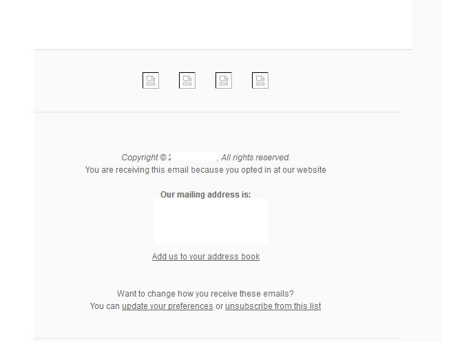
Here’s an example of how your email will be viewed in case you do not add the preheader text.

2. Add Alt text for all the visual elements
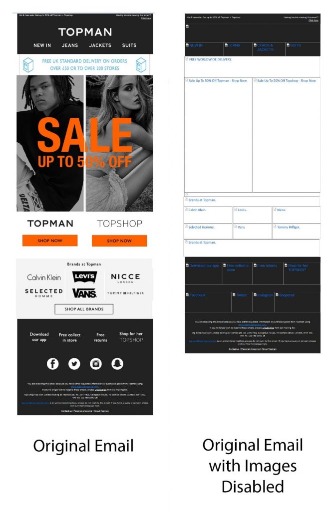
You cannot do away with visual elements in emails. However, it is important to consider the rendering of these elements across the diverse email clients. Many email clients have images turned off by default, owing to which the user might not be able to understand the purpose of the email.
Take a look at the screenshot below.

To make sure that your email does not look like this, always add Alt text to the imagery included in the email. This practice is also crucial when it comes to creating accessible emails.
Here’s an example showing the right usage of Alt text.

3. Avoid using JavaScript
Mostly every email client blocks JavaScript as it can conceal malware and lead to security issues. Consequently, you should not use it in your emails.
4. Choose your fonts wisely
Include the standard web-safe fonts in your emails so that there are no rendering issues.
If you plan to use custom fonts to grab the reader’s attention, it is a must to add fallback fonts with similar height and spacing. The safest bet is to use fonts like Arial, Comic Sans, Courier New, Georgia, Impact, Palatino, Tahoma, Trebuchet MS, Times New Roman, and Verdana.
Email clients supporting web fonts are enlisted below.
- Native Android Email client
- Outlook 2000
- Outlook.com app
- AOL Mail
- Apple Mail
- iOS Mail
- Safari browser
5. Inline CSS and tables instead of using CSS Stylesheets
Emails render differently from websites. Many email clients do not support stylesheets which makes it incumbent upon the developer to use tables and inline styles rather than CSS.
6. Use tables rather than divs
While websites are designed using divs, most of the email clients do not support <div> tags. Therefore, emails should be coded using table tags. Moreover, it is easier to create responsive emails with tables.
7. Specify HTML text for CTAs
It is strongly recommended you do not use images for your calls to action. CTAs should be written in HTML text for better rendering. Also, do not have any CTAs in the background images.
8. Standard bullets are more preferable over custom-designed bullets
Use standard bullets instead of custom-designed bullets so that there are no rendering issues. Alternatively, you can make the bulleted list into an image with suitable alt text.
9. It is safe to use <br> instead of “float” and “clear”
Float and CSS properties of CSS can get mixed up in the emails. Therefore, it is better to use HTML code as <br> instead of CSS.
10. Mention the widths and heights in pixels instead of percentages
Some email clients do not look at percentage values as a valid property. If you have to manage large images within the email designs, it is advisable to use pixel sizes as opposed to percentage values.
Wrap up
The foundation of designing a flawless email that renders well across every device and email client is “responsiveness”. Design for “Images Off” so that it overcomes the problem of image suppression.
If you follow these two tips and test your emails before every send, you will surely conquer the obstacle of improper rendering.
Author Bio
Chintan is Head of Operations at InboxArmy LLC. He has been into email marketing domain from last 7 years. Chintan is connected to InboxArmy, a professional email marketing agency that specializes in providing advanced email marketing services from email production to deployment. Chintan’s track record of email marketing success covers building email programs from scratch and using data-driven strategies to turn around underperforming accounts.


