

Your newsletter is an important part of your branding and marketing efforts. It’s where you showcase your brand personality, upsell products, and strengthen your customer communities.
But creating a great brand newsletter is easier said than done. So why not take inspiration from some brands that have got it right? Read on for 4 examples of stunnig brand newsletters that you can learn from today.
Apple: reinforce your branding in every element
Your email newsletters are an important touchpoint, an opportunity for you to showcase your unique brand to your customers. Every newsletter to your customers is a chance for you to strengthen your brand and stand out against your competition.
The key to this is consistency across every channel: your website, social media, emails, and so on should all reflect the same branding elements. And for a masterclass in newsletter branding, one need look no further than tech giant Apple:
Download Branding Resources Guide
Building a brand starts by having the right tools and advice. Download our top 10 essential tools and resources to kick-start your branding.

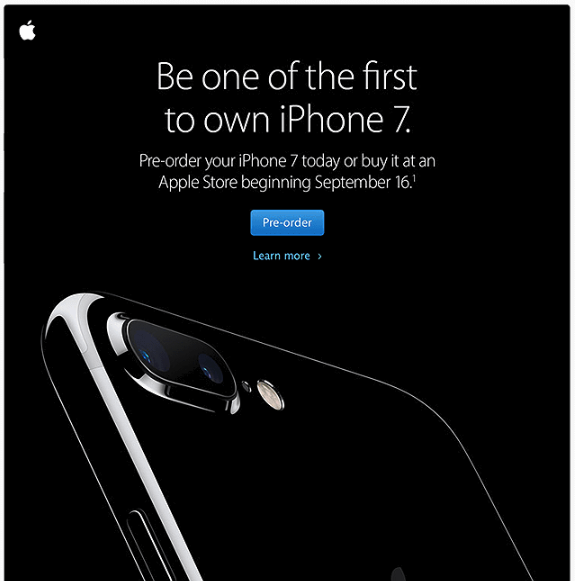 Image Really Good Emails
Every aspect of this email exudes the Apple branding, from the cool monochromatic color scheme to the iconic sans serif font. This is complemented by the large, high-quality image that takes center-stage in the email — unmistakably Apple in its style.
The language used in the newsletter also appeals to the brand’s exclusivity. Every new product launch is met with queues hundreds of people long, and the invitation to “be one of the first” to own the new iPhone echoes that sense of anticipation.
What you can learn from it
Apple’s branding is a success story that everyone can learn from. Consistency is crucial. use the same font across every channel, the same color scheme, the same language, and so on. Even the timing of your newsletter should be consistent to nurture trust with your audience.
Just as important are the words you use to write about your brand. Your brand personality should permeate your newsletters through your copy, continuing the conversation across each communication.
The Creative Independent: show your audience you care
A successful brand newsletter should a) get opened, and b) get read. An intriguing subject line can help with the former, but with the latter, you should appeal to your readers as individuals.
This is achieved by fostering a customer community, showing your audience that you value their input towards your brand.
Creative hub The Creative Independent (TCI) knows the value of their audience to their brand, as exemplified in the newsletter below:
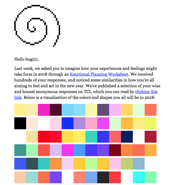
Image Really Good Emails
The newsletter opens with an affectionate term for TCI’s readers, a term that compounds the sense of belonging to a community. But it’s the content itself that really shows the reader their importance to the brand.
Not only did TCI actively seek out its audience’s input in their Emotional Planning Worksheet survey, but it also acted on the responses to provide value to its readers too. This comes in the form of a color visualization of the audience responses. It’s engaging, relevant to TCI’s target audience of creatives, and strengthens the brand-reader relationship by acting on your audience input.
What you can learn from it
The Creative Independent’s newsletter above shows the importance of valuing your audience and nurturing a two-way relationship with them. Actively invite input from your audience in the form of surveys, questionnaires, UGC contests, and so on.
But don’t let this input sit idle. Collate the best responses and send them out in your next newsletter, tagging individual customers by name (with their consent). Alternatively, transform survey responses into an infographic for some quick and interesting newsletter content.
Adobe: visual stuff is the hook that draws audiences in
The power of visuals is often shouted about in branding and marketing — and with good reason. A picture tells a thousand words, and we remember 80% of what we see and do (compared with 10% of what we hear and 20% of what we read).
And when it comes to your brand newsletters, strong visuals helps hook your readers and engage them with your actual content. Take the example from software brand Adobe, below:
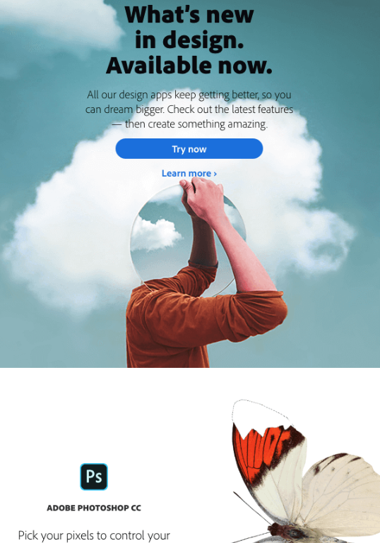
Image Really Good Emails
What makes this newsletter stand out is its genuinely unique and eye-catching images.
Yes, its headers are bold and promising (what Adobe customer wouldn’t want to have the newest design features at their fingertips?) and its copy is concise and inspiring. But its the visual content that undeniably grabs the reader’s attention.
Intriguing mirror effects, high-res photos of gorgeous butterflies, splashes of color — all transfix the reader, keeping them locked into the newsletter, like moths to a flame. As a consequence, they are more susceptible to the other content in the email.
What you can learn from it
As a creative brand, Adobe has no shortage of stunning imagery to hand (not to mention a budget for it). Thankfully, you don’t need to have a big budget or a team of creatives to benefit from eye-catching visuals in your newsletter.
There are plenty of free photo sources that offer unique, creative content (like these crowdsourced photos for free use). Remember to only use photos that are relevant to your industry — a snap of a refreshing cold drink on a beach might look nice, but if you’re a tech company then it just won’t wash.
Unique, high-quality visuals that are a far cry from the generic stock photos you usually find in newsletters go a long way towards engaging readers with your message. Use visuals as the hook that leads your audience towards the cruz of your newsletter.
Google: concise and user-friendly wins the race
The average office worker receives 121 emails a day. As such, the time they spend sifting through them is limited, and their attention will only be focused on the most user-friendly and readable.
Dense reams of copy and unintuitive formatting repel readers. It’s visual noise that will put off even the most committed newsletter subscriber. For an example of user-friendly newsletters done right, take a look at this email from Think With Google, the search engine’s digital insights brand:
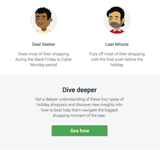
Image Really Good Emails
The newsletter itself provides a breakdown of different types of holiday customers, with an invitation to learn more with a bold call-to-action at the bottom.
But the information is broken up into small sections, no more than one or two sentences long, with clear, intuitive headings to delineate each one. Each section is also complemented by a small graphic representing each type of shopper, adding an engaging visual element to help the reader process the information.
The newsletter piques readers’ interest, and gives them a clear direction should they wish to find out more about the subject. It’s a fine example of a concise, user-friendly newsletter that puts the reader first.
What you can learn from it
If you want your newsletter to be read and engaged with, its user experience is of tantamount importance. Strive for a logical, intuitive direction for your newsletter and break each section down into distinct subheadings.
Avoid excessively long sentences too — no more than 25 words. While it might be tempting to be verbose and flamboyant with your language, it won’t appeal to every reader. Short and sweet with simple language makes it easy for subscribers to stay engaged with your newsletter.
Struggling with your brand newsletter? No problem! Learn from the best and follow the tips above to create a newsletter that engages customers, reinforces your branding, and satisfies your readers every time.